The colors of spring 2017
Pantone is a US company which is focused on technologies for graphics, the color cataloging and production of these identification system last. Over time it has become the international standard in terms of graphics and color management in industry and chemistry. Lately also the fashion world is inspired by the choices of this company for the creation of the new season’s trends.
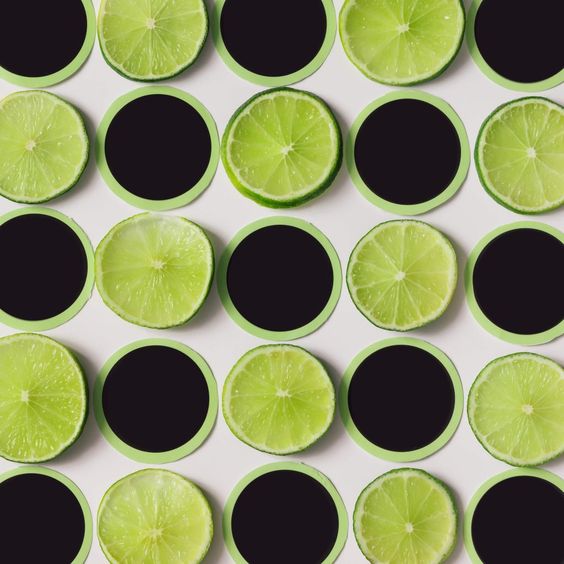
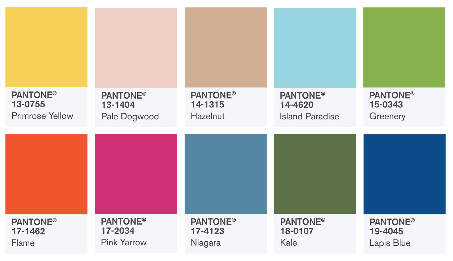
Immediately after the Fashion Week in September, the institute has prepared the Spring Summer Report 2017 which promotes the 10 colors for Spring Summer 2017 including the color of the year: the famous Greenery (a beautiful bright, refreshing green which has in itself a lot of yellow and that speaks of our desire to try and experiment to reinvent ourselves. It ‘s like the green of the renewal of spring leaves, a green that is suitable for many color palette, with neutral tones and shades of blue, but even stronger colors).
The description of feelings and emotions that start and develop with colors themselves are very important to give us creative ideas and to introduce a spirit of innovation in the new fashion currents for this year. The main colors of this season give a sense of solidity and warmth, remind us of the nature that surrounds us and of course the feelings we perceive from it.
This year the institute has opted for a series of very bright colors, but also combines them with neutral tones and earthly shades.
It does not go unnoticed the intense fuchsia pink (Pink Yarrow) or intense and vivid blue (Blue lapis) that gives energy, the Niagara reminds of ttypical denim and with it the need for a comfortable feeling and a casual style; again this yellow that reminds us of the warmth of the summer sunny days (Primrose yellow); Flame, however, which is an orange with a strong red base, warms the heart and enlivens the spirit; Island Paradise is instead an almost transparent turquoise, reminiscent of distant islands and pure and transparent waters.
Among the neutral colors we can find the Pale Dogwood, a delicate pearly pink that delivers a sense of purity and freshened and and Hazelnut delicate a more neutral earthly shade that brings us back to earth tones and concreteness: a transition color that naturally adapts to the changes of the seasons and colors that accompany them.
Last but not least Kale, a strong military green, but at the same time, suitable for any type of pairing.
The presentation that is given to these 10 colors reveals a vocation to the feeling and the emotional side All of them produce a nice effect, almost healing our spirit after winter months of cold and dark. If we want to create something for ourselves, we may follow these color pairing tips…
Let’s have fashion colors in our wardrobe this year!